To create Apple TV’s new branding, a team from the global agency TBWA\Media Arts Lab (MAL) gathered in a studio with a blacked-out stage, a giant glass version of the Apple TV logo, and a bevy of colorful studio lights.
Using just practical effects, they created a new animated logo for the brand that will roll out at the beginning of Apple TV’s shows and films, on its app, and in marketing campaigns over the coming months.
Apple TV+ becomes Apple TV
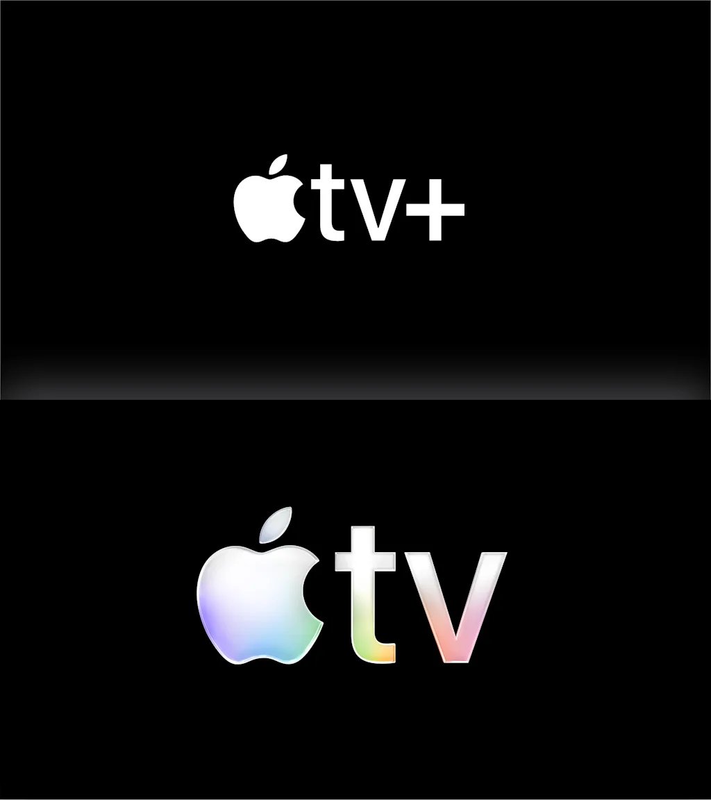
Apple TV’s updated branding, which includes a fresh static logo and two animated mnemonics, comes less than a month after the company announced that it would be changing its name from “Apple TV+” to just “Apple TV.”
The name change might seem subtle, but for Apple, it signals the company’s belief that consumers know and trust its streaming service. In an October interview with Fast Company, Richard Swain, partner at the global brand agency Further, said dropping the “Plus” was, at its core, “a show of confidence from Apple.”
Now, the company is backing that up with new Apple TV branding that pays homage to Apple’s design history—both by referencing one of the company’s most iconic logos and by relying purely on practical effects, echoing Apple’s legacy of meticulous craft in its product design.
For Apple TV’s new era, MAL—which is a bespoke agency that partners only with Apple—had a daunting task. It had to reimagine the brand from the ground up, creating a visual identity that was both unmistakably Apple and distinctly Apple TV.
To achieve that goal, MAL needed to balance Apple’s history of simple, elegant design with the color, motion, and texture that one would expect from a film-centric brand. Prior to this overhaul, Apple TV+’s logo and mnemonics were black and white. MAL’s first objective was to add color to the mix.
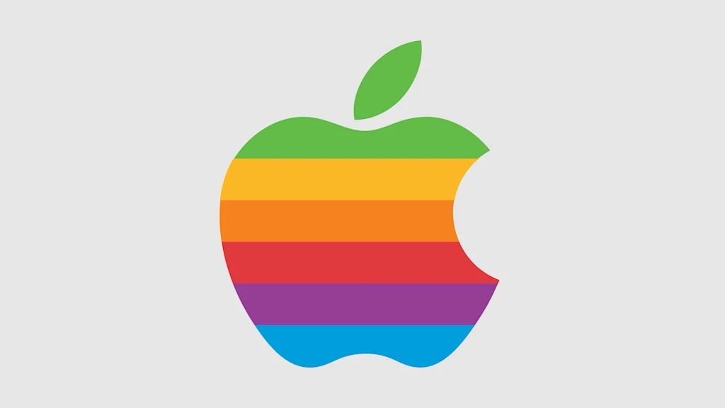
As inspiration, the agency turned to Apple’s 1977 logo—one of its most memorable icons, which showed the company’s signature apple rendered in six slices of rainbow color. Those hues appear as a subtle gradient in Apple TV’s static logo, and feature prominently in both the five-second- and 12-second-long iterations of its new animated mnemonics.
Bringing practical effects to Apple TV’s most ubiquitous brand asset
From the beginning, the team at MAL knew they wanted to shoot the Apple TV animatics using only practical effects. The goal was to embrace the craft of filmmaking by capturing the organic behavior of light that digital simulations can’t entirely perfect.
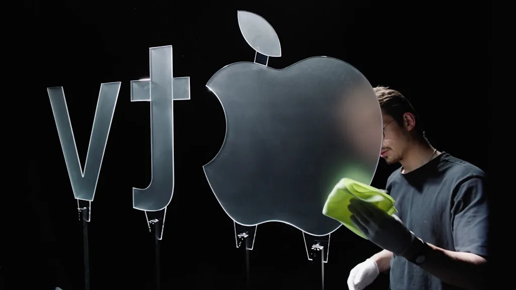
This process started with a series of physical versions of the Apple TV logo, each sculpted from solid glass and made in partnership with the London-based creative studio Optical Arts. Every piece was cut and polished differently to study how it interacted with light, reflections, and depth.
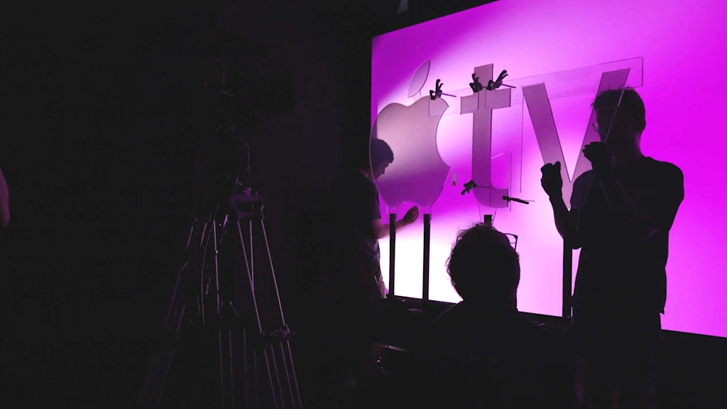
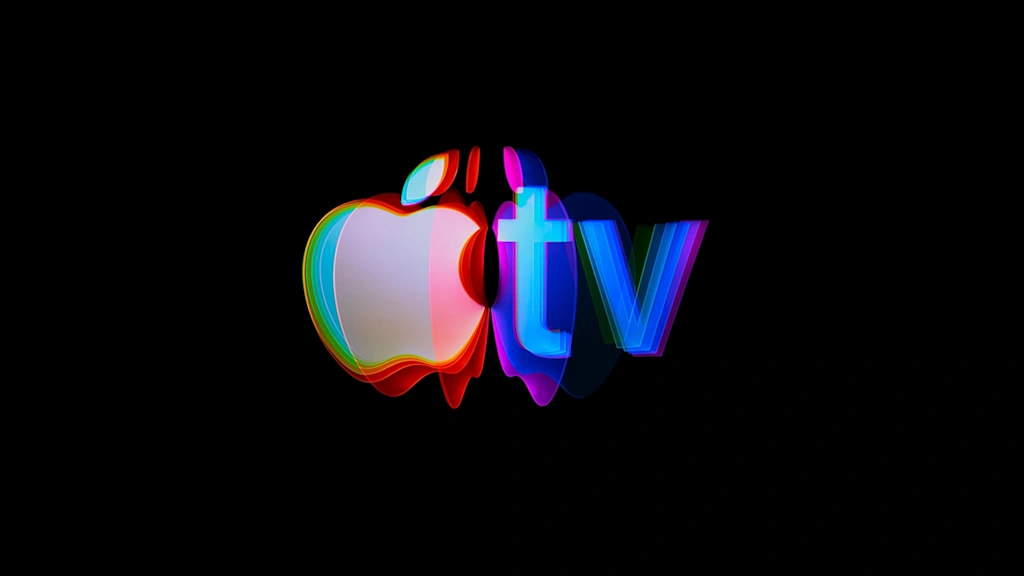
Once the final version of the logo was selected, it was filmed several times under specific lighting conditions. The team embarked on a weekslong series of experiments with light angles, diffusion, movement, and color, refining exactly how each shot should reflect and refract on camera. Both of the final mnemonics feature the Apple logo flipping through various glowing, prismatic hues before ultimately landing on the new static logo.
The animatics are accompanied by an audio component composed by songwriter, producer, and Oscar and Grammy winner Finneas O’Connell. MAL’s new branding for Apple TV is a testament to the fact that sometimes practical effects still deliver something that digital or AI-powered touch-ups can’t copy. Compared to Apple TV+’s formerly bland branding, it’s a bold choice that brings some life and brand connection back into the service’s visual identity.


