Keep it safe, keep it small, keep it concrete: How a “someday project” finally shipped
Medium has been around for 14 years. In that time, dark mode went from a novelty to a must-have, especially for sites built for reading. In my seven years on the web team, however, it never made it onto our roadmap.
Why? Readers asked for it and teammates often asked what it would take, but there was just always another project that needed our engineers more.
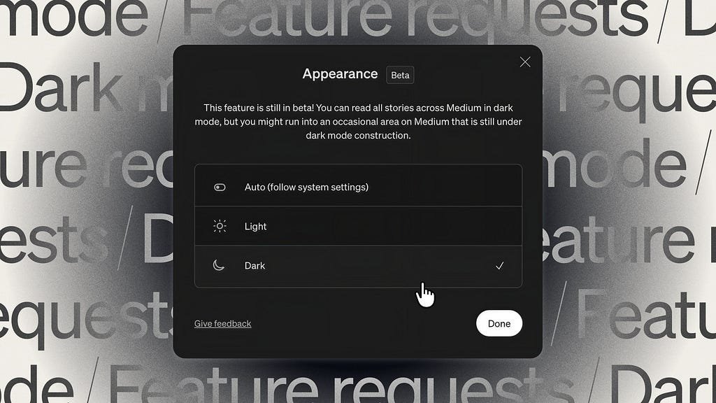
This year, that finally changed, and I’m so excited to say that (most of) Medium now supports a dark theme! The energy inside the company has been huge, but the cherry on top was hearing from readers who went out of their way to fill out our feedback form just to say thank you. Seriously, who does that? To everyone who wrote in: thank you so much. It feels wonderful to finally deliver this to our readers, and soon to our writers too.
This story is about how it happened. Part of it is technical, like why dark mode was harder for us than flipping a few colors. But a big part of it is personal, because the hardest piece for me wasn’t the cache or the CSS, but taking the first steps.
Starting without a ticket
For most of my career, work has reached me as a ticket someone else wrote. I’m good at that. I’m careful, I follow through, and I like finishing things.
Dark mode lived in a gap I think a lot of teams have: work the company clearly valued, but kept getting edged out by larger initiatives. It was the first time, though, that I felt strongly enough about something in that gap to try closing it myself.
We’re a small team, and our design team is even smaller and juggling a ton. But when the web team met to pick a few projects outside our feature work earlier this year, I suggested we finally build it. I believed it could be done without dropping any product work. All we needed was a plan and someone to take the first steps.
I didn’t want to ask the team to trade something important away, and even with plenty of enthusiasm, our current projects were taking up all of our bandwidth. So I started small, on my own, just to see whether the plan would hold up.
Looking back, now that the dark mode reader experience has shipped, I can point to three guardrails that made it work.
Three guardrails
1. Keep it safe. This project was going to span the entire front-end codebase. Because I was starting this as a proof of concept, I needed to make sure I didn’t neglect my team’s priorities (reposting), step on any of my other coworkers’ toes (no big refactors to slow anyone down), or disturb the reading experience while work was in progress. The last thing we wanted was for a post page to have white text on a white background or for pieces of content to appear missing because there wasn’t enough contrast.
2. Keep it small. Work had to come in small, clear pieces that someone else, or an agent, or even future me, could pick up without needing to download a ton of context. That meant small tickets, tools that let anyone see the result instead of trusting me, and maybe most importantly, small and very-easy-to-review PRs. It also meant a small, precise target. I’d check every page, but the top priority was a perfect post page, since it’s our most visited page at nearly 4 million views a day.
3. Keep it concrete. Bring people in when there’s something real to react to. Every time dark mode came up before, it was an idea, and an idea invites every reason it could fail: How long will it take? What’s the opportunity cost? Shouldn’t we modernize the legacy code or update the design system first? A working proof of concept changed the conversation from “what if we built dark mode?” to “here it is, and here’s what’s left.” It answered most of the engineers’ questions, gave design something to weigh in on when they had time, and gave leadership a path with countable steps instead of one more proposal to rank.
That’s the short version. The rest of this post is the longer one: what we already had, what made dark mode harder than it looks, and where each guardrail came into play. It gets a bit more technical from here, but I’ll explain things as I go.
What we already had, and what changed
Medium fortunately had many of the pieces already. We had a design system, and most of our colors were stored as tokens, named values like “background”, “foreground”, etc that get reused across the site. Our mobile apps also supported dark mode already, so we had a palette to start from.
So why hadn’t it happened? Because even with those pieces, dark mode looked like a huge project that would pull several engineers off product work for weeks, if not months.
That fear wasn’t unreasonable. When Figma built theirs, about 40 engineers spent a dedicated week just converting colors to new tokens. That week came after months of planning and was followed by months of polish. Stack Overflow’s took about nine months from first experiment to beta. Our entire web team is seven people. We couldn’t give dark mode 40 engineers for a week. We couldn’t even give it one full-time.
What changed for us was AI. Claude was my thinking partner while I planned, and my execution partner while I built, and together we found a way to break dark mode into pieces small enough for one person to finish between other projects, without pulling anyone off theirs.
But you can only break work apart once you know what the pieces are. For us, a few of the hardest ones weren’t about color at all. They started with how we serve pages.
Problem 1: Building it safely behind the edge cache
We use Cloudflare Workers to store ready-made copies of pages, the versions logged-out visitors see, on servers all over the world. This is called an edge cache. Every server holds the exact same copy, with nothing specific to any viewer, so the first thing a logged-out reader sees loads fast and accurately.
That was a problem for guardrail one. The new dark-aware CSS was going to be in progress for weeks, and I didn’t want a half-finished version cached and served to any reader. So I put dark mode behind a feature flag, a switch that turns a feature on for some people and leaves it off for everyone else. Staff would see dark mode, and everyone else would keep what they always had.
That meant temporarily splitting the cache in two. Readers with the flag on get the HTML with CSS that supports both light and dark. Everyone else gets the light-only CSS they’ve always had. We use Statsig as our feature flag and experiment system, and our workers keep a copy of the flags’ rules so they can answer one question on every request: is this flag on for this user? If yes, send the new CSS. If no, send the old.
The split was only ever meant to be temporary. Once dark mode was ready for everyone, the flag would come out and we’d be back to one cached page for every reader.
Logged-in readers were simpler. Their pages are never cached, so the server could check the flag directly on every request.
With all of that in place, I had my proof of concept: I could change any color on the site, and only staff would see it.
Problem 2: The flash of white
With a safe place to work, the next piece was the theme itself. We updated our theme to use color tokens a couple of years ago, but each token held a single hard-coded hex value, chosen to work on the one background color we supported: white.
These values were used in components across the app, so whether the HTML came from the edge or straight from our servers, we were telling the browser exactly which colors to paint. And the browser doesn’t wait. As soon as it has the HTML and CSS, it starts painting, before any JavaScript has finished. So as long as the colors stayed hard-coded (Make this box white!), dark mode readers would see the page in white first. Then JavaScript would run its check (does this reader want dark mode? If yes, swap the CSS), and the page would update. Anyone who has walked this path before knows the effect: a Flash of Incorrect Theme.

There were a few ways we could have fixed it.
- We could have kept the JavaScript check and made it run sooner. That shortens the flash but doesn’t remove it, because the browser still paints before any script runs.
- We could have cached two versions of every page, one light and one dark, and served each reader the one we thought was right. The feature flag already split the cache, but only until launch. This would mean keeping two copies of every page forever. Worse, we don’t store preferences for logged-out readers, so we’d be making an educated guess, but some readers would still get the wrong copy and see the same flash. And because every experiment we check at the edge already splits the cache, adding light and dark on top would double all of it.
Think of it like packing for a trip. Two shirts give you two outfits. Add two pairs of pants and you have four. Add two pairs of shoes and you have eight. Each new choice doesn’t add one outfit, it doubles all of them. Our cache works the same way. Light or dark is one choice, and every experiment we check at the edge is another. Five experiments would mean 64 copies of every post. That’s over 2,000 copies of every single story. For reference, we currently check 10.
3. Or we could stop telling the browser which color to paint and give it the tools to decide. With the CSS light-dark() function and the color-scheme: light dark; declaration, every color token in our theme could hold both a light and a dark value, and the browser could pick the right one from the reader’s settings before the first paint. This is what we went with. It meant refactoring every token from a hard-coded hex value to a CSS variable:
/* before */
  colorTokens: {
    background: {
      neutral: {
        primary: {
	  base: '#FFFFFF',
        },
      }
    }
  }

/* after

CSS

:root {
  color-scheme: light dark;
  --color-bg-neutral-primary: light-dark(#ffffff, #171717);
}

*/

  colorTokens: {
    background: {
      neutral: {
        primary: {
          base: 'var(--color-bg-neutral-primary)',
        },
      }
    }
  }
I converted the tokens in a series of small pull requests, since they’re quick to review and don’t demand much context switching. (Keep it small!) Put together, here’s how a page now decides between light and dark:
Problem #3: The ghosts of our past
There weren’t too many tokens, so once they were converted I figured most of my work was done. It wasn’t. Plenty of pages still didn’t flip, for two reasons. Some set their background color directly instead of using a token, and others pulled colors from parts of our theme left over from an older era. Let’s travel back in time.
Years ago, Medium let writers and publications customize how their posts and home pages looked. That feature is mostly gone, but most of its code wasn’t, and it predated our tokens. So dark mode, a shiny new feature, would double as a serious cleanup project.
https://medium.com/media/48eb4ff822c111aa047ae2e0d1d3ac8f/href
This is where Claude did some of its heaviest lifting. I asked it to go through every page in our modern codebase, from the top level down to the smallest component, and look for two things: hard-coded colors and any styling that didn’t use our tokens. For each problem it found, I had it fill in a Notion database with the file, line numbers, severity, whether it’s a shared component or a page, the suggested fix, and how to reproduce it.
Next, I had Claude turn the database into tickets. Seeing the problems grouped showed me the scope and where to start. Claude wrote each Linear ticket with all the context someone would need, so no one had to ask me anything. This is guardrail two: a ticket had to be small and clear enough that a person, an agent, or future me could finish it easily, ideally without any major collisions with anyone else’s work.
Of course, Claude didn’t catch everything. I am unaware of any fool-proof replacement for human QA, yet. And some issues were hard for Claude. For example, whether a translucent color should flip depends on what’s behind it (more on this later). You can’t see that in a stylesheet. You’d need to look. But using AI to do the sifting and ticket creating — having it find all the places that I needed to clean up in less than 10 minutes from prompt to database! — was a huge unlock for me, and knocking out the list cleared most of the really glaring issues. My teammates and I caught the (many) little things that were left in manual QA.
Problem 4: Two front ends, and a real debate
Medium has two separate front-end services, meaning two different systems that build the pages you see. One serves most of our pages, and we’ve since dubbed it the reader experience. The other is our older legacy service, M2, which still powers the Story Editor, some publication settings pages, and a handful of others.
That raised a question we debated internally: could we release dark mode for the reader experience first, or did it have to launch everywhere all at once? The answer wasn’t mine alone to give.
Before this project, I wasn’t a dark mode user, so I didn’t have a strong opinion. Others were firm that we couldn’t say “Dark mode is here!” until it was everywhere. I could see both sides. To me, it came down to what story Medium wanted to tell, and either way, it didn’t block the work — any work I put into one system got me closer to finishing the whole thing. I started with the reader experience because it’s the codebase I work in every day, and once the tokens were converted, the rest was tedious, but I knew how to do it.
Once the reader experience was close to done, I was pulled into our team’s product leadership meetings. For at least seven years, dark mode had been an idea to weigh against other initiatives, and it lost that weigh-in every time. This time, there was nothing to weigh. Leadership could see it working, so we skipped the question of whether to do it and went straight to how to roll it out. Two facts and our operating principles made the case for releasing the reader experience first.
First, Datadog logging I’d added early on showed that roughly 25–40% of sampled sessions started with the reader’s OS set to dark. Second, most people come to Medium to read, not to write, and the reader experience is what they see. Since one of our operating principles is to ship something to readers and writers regularly, we decided to ship it first, with a promise not to let the rest of the pages slip.
Until then, I’d been working on dark mode in the shadows, on my own. Now it had leadership behind it, and I could start asking other teams for help.
Calling in the cavalry
Design was the first place I asked for help. The mobile team’s dark palette gave me a starting point, not a finish line. One of our design leads, Desiree Garcia, had started a channel for async design feedback, and it became my first stop for quick questions. I knew the design team was stretched thin. Asking for a whole new palette wasn’t reasonable, but asking for individual color fixes was a much smaller ask. Sophie Aguado, our product designer, stepped up almost every time. We set up ad-hoc Zoom calls to work through colors that needed a judgment call, how to handle elevation, and plenty of other things I’ve never had to think about. They even let me sit in on a design jam where the team reviewed the post page in dark mode together, which taught me a lot and helped get it over the line.
Dark mode is a design problem as much as an engineering one. I’d have shipped something technically correct and visually wrong without those conversations.
I was also able to start collaborating with content and marketing about the story we wanted to tell and how we would shape the release, which was fun and different from how we normally release features. Huge thanks to Zulie @ Medium for orchestrating this.
I even got possibly the best gift of all: J. Kim, another human engineer, to help me finish the last 10% of the reader experience, plan how to bring dark mode to our older system, and just be someone to bounce ideas off and ask for help.
Problem 5: M2, where you can’t just flip the variables
With the reader experience mostly done, it was time to turn to our white whale, M2. It spans all 14 years of Medium’s history and still houses many of our APIs and a few notable web pages. Do you know that meme where a junior engineer pulls one innocent-looking stick out of an elaborate structure and the whole thing comes crashing down? That’s how most of our web engineers feel about working in M2.
Its styles are written in LESS, with variables like @color-white and @color-black. The obvious idea is to swap those values in dark mode, but that doesn’t work, because the same variable does opposite jobs. @color-white is the page background in one place and the white text on a green button in another. Flip it, and that text turns dark and fails our accessibility contrast requirements.
The translucent blacks were worse. Body text is rgba(0, 0, 0, 0.84), black at 84% opacity, and a scale of these values runs through about 450 declarations in 70 files. Some are text, some are borders, some are shadows, and some are near-opaque panels and overlays on photos. Black-at-84% becoming white-at-84% works for text. For a dark panel it gives you a near-white panel, and for an overlay on an author’s photo it washes the photo out instead of darkening it. Every place a color is used needed its own decision.
Keeping it safe and small
Guardrail one still applied: light mode couldn’t change at all. J. Kim copied the reader experience’s color tokens into M2, each holding a light and a dark value, and we converted declarations one at a time. Because M2’s light colors were written into each style, often with slightly different values, every conversion keeps today’s color inline as the fallback:
color: var(--color-fg-neutral-primary, rgba(0, 0, 0, 0.84));
When the dark mode tokens aren’t on the page, the browser uses the fallback and nothing changes. Light mode renders exactly the same, so every conversion is safe to ship to everyone at any time. (Keep it safe!)
Going dark one page at a time
What makes M2 slower than the reader experience is the unit of work. We convert style files, but pages are what go dark, and a page can’t go dark until every style file it uses has been converted and checked.
Even counting the pages was hard, so I had Claude write a coverage script. It listed every page M2 can render (121 templates, 50 that users can see), the style files each one uses, and which colors in those files still needed a decision. A handful of shared files, like buttons, cards, and the post body, blocked most pages, so we converted those first.
To release pages, J came up with a plan based on how his friend quarantines new fish before adding them to his aquarium. Each page starts in a quarantine tank, a staff-only flag where we can test it safely. Once it passes QA, it moves to the main tank: the dark mode rollout readers already have. There’s a lot more to say about M2, from the rules we wrote for Claude to the bugs that made us write them, but I’ll save that for its own post.
Where it landed
The reader experience shipped to 100% of readers on October 1. M2, which essentially covers the writer experience along with a few other pages, is the last piece: every ticket is merged and pages are in QA now.
I first floated dark mode to the web team in February, with no plan behind it yet. I posted the technical design doc on April 15, and the real work started May 8 with the first pull request. That’s less than five months to reach every reader, and for most of it, the work was one engineer, me, fitting it between other projects, with design help in small pieces and nobody pulled off their roadmap. In the same stretch, the web team also shipped a steady stream of feature updates and a huge improvement to our builds, one readers won’t notice but the seven of us feel every day. (Thank you, Julien Wawrzyniak, for owning that colossal effort.)
Dark mode didn’t always get my time. The longest pause was four or five weeks, while reposting was in full swing. But that’s the upside of a side quest, there is no due date. However far along I was, we were always better off than before, when dark mode had no foundation and no clear estimate how long it would take.
If you’re used to being handed tickets
I don’t have a heroic version of this story. I started out waiting to be asked, or at least for the team to agree we should take this on, and what changed wasn’t my confidence so much as my setup. The guardrails let me try something without permission, because they made it hard for me to cause harm, hard for my work to collide with anyone else’s, and easy for the right people to weigh in at the right time. Claude made it possible to try at all. With a partner to think through the plan and then take on the audit, the tickets, and the tedious parts, one engineer working between projects could carry what once looked like a job for a whole team.
If you recognize yourself in the first section, start with a small step and a safe one. You may find, like I did, that the work grows into something other people want to join.
Thank you to J. Kim, who helped me finish the last 10% of the reader experience and shape our M2 strategy; to our designers, Sophie Aguado, Nouf Aljowaysir and Emily Kelly, who answered my many questions while spinning plenty of other plates; and to anyone who reviewed, unblocked, or encouraged me along the way.
Dark mode was never on our roadmap. Here’s how it got built. was originally published in Medium Engineering on Medium, where people are continuing the conversation by highlighting and responding to this story.
Source: medium.engineering