By Parth Jain, Rakesh Sukumar, Yingwu Zhao, Renzo Sanchez & Nathan Fisher
How we built a living map of our distributed infrastructure to help engineers understand dependencies, troubleshoot faster, and keep Netflix running smoothly for our members around the world.
The Puzzle with a Thousand Pieces
Picture this: It’s 3am, and an engineer gets paged. One of our critical services is showing elevated error rates. Members trying to watch their favorite films and series are seeing degraded experiences. The clock is ticking.
In a system with thousands of microservices supporting our entertainment experience for members worldwide, answering these questions quickly can mean the difference between a minor blip and a major incident.
We kept hearing variations of this story from engineers across Netflix. The tooling gap was clear: we had plenty of signals, but no unified way to understand how everything connected.
The Three Questions Every Engineer Asks
When troubleshooting distributed systems, engineers fundamentally need to understand relationships:
Which services depend on each other? Not just theoretical dependencies from configuration files or architecture diagrams, but actual runtime connections based on real traffic.
What’s the blast radius? When something breaks or needs to go down for maintenance, what else will be affected? Which teams need to be notified?
Where’s the source? Is my problem caused by an upstream issue, or am I the root cause that’s cascading to others?
Traditional observability tools show fragments of this picture. Metrics show symptoms and performance characteristics. Logs show individual service behavior. Traces show single request flows through the system. But none of them show the complete map of how everything connects — the steady-state topology of dependencies that forms the backbone of our distributed architecture.
For an engineer at 3am, having to mentally stitch together information from multiple tools is slow, error-prone, and stressful. We needed something better: a unified view of service dependencies — a map showing how everything connects — with easy navigation to the detailed signals when you need to dig deeper.
Why This Matters More Than Ever
Netflix runs on thousands of microservices working together to deliver entertainment to our members. When you press play on your favorite series, that single action triggers a cascade of service-to-service calls — authentication, recommendations tailored to your tastes, video encoding selection, playback optimization, and more.
This architecture gives us tremendous flexibility and allows hundreds of engineering teams to innovate independently. But it also creates fundamental observability challenges.
And these challenges were growing. New initiatives like our Live programming and Ads-supported plans require even more sophisticated monitoring and faster troubleshooting. Live events can’t wait for lengthy incident investigations. The scale and real-time nature of these systems demanded better tooling.
We analyzed thousands of support requests from our engineers over a four-year period. The patterns were consistent:
- “What are my upstream and downstream dependencies?”
- “Is this failure in my service, or is something I depend on broken?”
- “Which services will be impacted if I take this down for maintenance?”
- “Why is this service showing as ‘Unknown’ in my metrics?”
- “What changed in my call path recently that could explain this behavior?”
Engineers were asking dependency questions constantly. We needed to provide answers — quickly, accurately, and in real-time.
Building on What We Learned
We didn’t start from scratch. Over the years, we explored various approaches to solving this problem — from evaluating external graph databases and vendor platforms to building internal prototypes with different storage technologies and data models.
Each iteration taught us something valuable:
Real-time matters: Dependency maps that are hours old are useless in dynamic environments where services deploy multiple times per day. We needed near real-time updates.
Scale changes everything: Solutions that work at modest scale hit fundamental walls at Netflix scale. Storage systems that handle thousands of nodes struggle with our service count and traffic volume.
Integration is key: Any solution needs seamless integration with our existing observability ecosystem. Engineers shouldn’t have to learn entirely new tools or leave their existing workflows.
Data quality is critical: Incomplete or incorrect dependency information is worse than no information — it leads to wrong conclusions during incidents.
Multiple perspectives needed: We learned that no single source of dependency information tells the complete story. Network connectivity data lacks application context. Application metrics only cover instrumented services. We needed to combine multiple sources.
These lessons shaped every decision we made in building Service Topology.
What We Needed: A Living Map
We set out to build something specific: a living map of our infrastructure — one that updates in real-time as services deploy, as traffic patterns shift, as new dependencies form and old ones disappear.
The requirements were clear:
Real-time updates, not stale snapshots: In an environment where services deploy continuously, yesterday’s topology map is archaeology, not observability.
Fast queries at scale: When an engineer is troubleshooting at 3am, they can’t wait minutes for a query to return. We needed sub-second response times for traversing the call graph.
Multiple layers: Network-level connectivity doesn’t tell the whole story. We needed to see both the network layer (what’s actually talking to what) and the application layer (which APIs and endpoints are being called).
Rich context, not just connections: Knowing Service A talks to Service B isn’t enough. We needed to overlay health status, availability tiers, business domains, ownership information, and other metadata to make the information actionable.
Visual and programmatic access: Engineers needed a UI for exploration and troubleshooting. But automated systems — resilience frameworks, blast radius calculators, incident response automation — needed programmatic API access.
Our Approach: Three Sources of Truth
Here’s the key insight we arrived at: no single source tells the complete story.
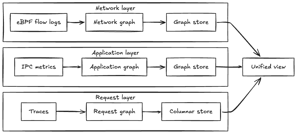
We built Service Topology by using three complementary sources to build separate dependency graphs — one from each perspective — that can be combined into a unified view or explored independently:
Each source creates its own graph that is physically separate — the network layer in one graph database partition, the IPC layer in another partition, and the tracing layer using columnar storage optimized for analytical queries. This physical separation allows each layer to evolve independently and be queried in parallel. When users request a unified view, we execute traversal queries across all layers simultaneously and merge results, achieving sub-second response times even when combining all three layers.
Each source creates its own graph of service relationships:
1. eBPF Network Flows (Network Layer)
We capture network flow records at the kernel level using eBPF technology — information about which services are connecting to which other services over the network. This gives us ground truth about actual network-level communication.
The value: Comprehensive coverage. Every service shows up here because we’re capturing actual network traffic, regardless of whether applications are instrumented. This layer provides topology at both cluster-level (which deployment clusters are communicating) and app-level (which applications are communicating).
The limitation: Network-level information lacks application context. We know Service A connected to Service B’s IP address using a specific protocol, but not which specific API endpoint or path was called (e.g., /api/v1/users vs /api/v1/orders).
2. IPC Metrics (Application Layer)
We collect Inter-Process Communication metrics from our instrumented services. These are the metrics applications emit when they make calls to other services via gRPC, GraphQL, REST, or other protocols.
The value: Rich application context. We can see which specific endpoints were called, error rates, latency distributions, protocol details, and request/response characteristics. This layer provides app-level topology — since IPC metrics are emitted by applications, the natural granularity is application-to-application connections with endpoint details.
The limitation: Only works for instrumented services. If a service doesn’t emit IPC metrics, we won’t see its application-level calls this way.
3. End-to-End Tracing (Request Layer)
We integrate distributed tracing information that follows individual requests as they flow through our system. We aggregate traces to build a unified topology graph, but also allow engineers to overlay individual traces on the topology to see specific request flows.
The value: Shows actual request paths. Not just “Service A can call Service B,” but “Service A did call Service B as part of serving this specific member request.” This captures runtime behavior, including conditional logic and feature flags. Engineers can both see the aggregated pattern and drill into individual traces. We aggregate traces to build topology at both cluster-level and app-level, allowing engineers to view request patterns at the granularity most useful for their investigation.
Get Netflix Technology Blog’s stories in your inbox
Join Medium for free to get updates from this writer.
The limitation: Sampling. We can’t trace every request without impacting performance, so we sample. This is excellent for understanding common flows, but may miss rarely-used code paths in the aggregated view.
Bringing It Together: Multi-Layer Architecture
Here’s what makes this powerful: we build three separate graphs — one from each source — that create different perspectives on service relationships:
- Network graph from eBPF flows: Every connection, regardless of instrumentation
- Application graph from IPC metrics: Rich endpoint and protocol details
- Request graph from tracing: Actual runtime behavior and call paths
Engineers can:
- View each graph independently to focus on a specific perspective (pure network connectivity, application-level calls, or traced request flows)
- Combine them into a unified graph by querying multiple partitions in parallel and merging results — our system returns the union of nodes and edges from all requested layers while preserving each layer’s distinct properties
The unified view is especially powerful because:
- Network flows ensure completeness — we don’t miss anything
- IPC metrics provide application details — we understand the “how” and “what”
- Tracing shows actual behavior — we see real request patterns
Each source compensates for the limitations of the others. The result is a comprehensive, accurate, and contextualized view of service dependencies that can be explored from multiple angles.
From Flows to Graph: How We Built It
Here’s the high-level architecture (we’ll dive deeper into engineering challenges in our next post):
Multi-Region Ingestion: We consume flow logs from Kafka across multiple AWS regions where Netflix operates. This runs continuously, processing millions of flow records as they arrive.
Distributed Processing: We use Apache Pekko Streams (a fork of Akka) to process these flows in a distributed, fault-tolerant pipeline. The system automatically partitions work across our Auto Scaling Groups to handle the volume and provides natural backpressure handling.
Three-Stage Distributed Aggregation: We aggregate network flows through a three-stage pipeline that solves a fundamental challenge: network flow logs only show individual network hops through intermediaries (App A → Load Balancer → App B, or App A → NAT Gateway → App B), not the true application-level connections we need (App A → App B).
Stage 1 performs initial aggregation from Kafka. Stage 2 applies resolution logic — identifying network intermediaries (load balancers, NAT gateways, API gateways, proxies) and combining their incoming and outgoing flows to reconstruct direct application-to-application paths. Stage 3 performs final aggregation with health status integration before graph persistence. This graduated approach also prevents hot spots by distributing load across multiple points even when specific applications or network intermediaries see 100x more traffic than others.
Graph Storage: We persist the topology in Netflix’s graph database, an abstraction layer built on top of our distributed key-value storage infrastructure. This graph database is specifically designed for high-throughput graph operations at our scale, with fast multi-hop traversal capabilities. Each of our three data sources (network flows, IPC metrics, tracing) creates a separate graph that can be queried independently or merged.
gRPC API: We expose the topology through a gRPC service that supports multi-hop traversal, filtering by availability tier and business domain, pagination for large result sets, and sub-second query response times.
The technical details of building this at Netflix scale — handling Kafka lag, managing memory and garbage collection, optimizing distributed processing, debugging reactive streams — deserve their own discussion. We learned a lot, and we’ll share those lessons in our next post.
What Engineers Can Do Now
Today, the service topology map is helping engineers across Netflix:
Visualize Dependencies: See upstream and downstream dependencies for any service, with the ability to filter by availability tier (Tier 0, Tier 1, etc.) and business domain. Choose between the unified view (combining all sources) or individual graph views (network-only, IPC-only, or trace-only) depending on what you’re investigating.
Jump to Detailed Signals: From any service in the topology, quickly navigate to logs, traces, and detailed metrics in their respective tools. No more hunting for the right service name or time window — the topology provides the context and the starting point.
Understand Blast Radius: Before taking a service down for maintenance or making significant changes, see exactly what will be impacted. Identify which teams to notify and what to monitor.
Overlay Health Status: See not just the topology, but which services in the call path are experiencing issues. This is integrated with health status tracking, so you can quickly identify if a problem you’re seeing is actually originating somewhere else.
Query Programmatically: Use our gRPC API to integrate topology information into automated systems. For example, our Platform Modernization Engineering team uses this to verify that critical Live services have proper availability tier classifications throughout their dependency chains.
Investigate Faster: During incidents, quickly identify if a failure is local or if it’s propagating from somewhere else in the call graph. Follow the failure pattern to find the root cause.
Plan Changes Confidently: Understand the impact of proposed architectural changes or service migrations before implementing them.
Time Travel Through Topology: Query what the topology looked like at specific points in the past. Understand what changed in dependencies around the time an issue started, or see how your service’s dependency footprint has evolved over time. This time-travel capability is powered by time-window aggregation — instead of storing every time slice separately, we use layer-specific aggregators that accumulate topology data across windows, allowing us to reconstruct historical views efficiently without exploding storage costs.
The Living Map: Always Current
What makes this truly useful is that it’s a living map. It’s not a static diagram drawn in a design document that goes out of date the moment it’s published. It’s continuously updated based on actual traffic:
- When a new service starts calling an API, it appears in the topology with near real-time freshness
- When a service stops making calls to a dependency, that edge fades from the graph
- When services deploy and their behavior changes, the topology reflects it
- When incidents impact service health, the status overlay updates in real-time
This means engineers can trust what they see. The map reflects reality, not someone’s idea of what the architecture should be.
The Journey Continues
We’re not done. We continue to evolve the system with new capabilities:
Change Event Overlay: We’re working to surface deployment events, configuration changes, and other mutations alongside the topology graph. Correlation becomes easier when you can see both the dependencies and what changed when.
Richer Context: As we expand coverage and integrate more signals, we continue to enrich the topology with additional endpoint-level details, protocol information, and network path context.
And looking further ahead, we’re excited about something bigger: Automated root cause analysis. Imagine an intelligent agent that continuously crawls the topology graph, correlates failures across dependencies, understands historical patterns, and surfaces likely root causes automatically. Service topology provides the knowledge graph foundation that makes this kind of intelligent automation possible.
Why This Matters for Our Members
This might seem like infrastructure — plumbing that our members never see directly. But it matters immensely to their experience.
When engineers can quickly understand dependencies and identify issues, incidents get resolved faster. When we can model blast radius before making changes, we avoid disruptions. When automated systems can query dependency information programmatically, we can build smarter, more resilient systems.
All of this translates to what matters most: our members getting to watch their favorite films and series, seamlessly, whenever they want. Whether it’s a weekend binge of a beloved show, a live sports event, or discovering something new through our recommendations tailored to their tastes — we want it to just work.
What’s Next in This Series
This is the first in a series of posts about building Service Topology at Netflix.
In our next post, we’ll pull back the curtain on the engineering challenges we faced at scale: How do you handle Kafka consumer lag when ingesting millions of flow logs per second? What happens when distributed processing meets garbage collection pauses? How do you debug reactive streams that stall under load? How do you manage hot nodes in a distributed system? We’ll share the real problems we hit in production and the solutions we developed.
In future posts, we’ll explore the lessons we learned that apply to any distributed system at scale, and where we’re heading next with time travel capabilities and Automated root cause analysis.
Acknowledgements
This post was written by Parth Jain.
Service Topology was built by Parth Jain, Rakesh Sukumar, Yingwu Zhao, Renzo Sanchez-Silva, and Nathan Fisher.
Special thanks to the many engineers across Netflix who made this possible — the Observability team who built the broader system, the graph database platform team who provided the storage foundation, and the Platform Modernization Engineering, Live, and Ads teams who provided invaluable feedback and use cases throughout development.
Source: netflixtechblog.com